5 Typography Rules for Readable Blog Content
Have you ever wondered why blogs and news content online often use just a thin column, leaving so much white space to the left and right? Or maybe you’ve come across a site that doesn’t do this, and you found it strangely hard to parse the content?
Well, there’s a good reason behind this convention. The way typography and text layouts are handled on the web can have a major impact on content readability.
My colleague Will Macowski recently wrote a great piece on how when it comes to content, structure precedes substance. The substance, however, also needs a design touch.
Keep reading for five typography rules that will help improve the readability of your blog content.
1. Why font size matters
On the web, we often consider 16px the base font size. In most browsers, with default settings, 1 rem (or root em, the base font size) is usually 16px.1 This works great for basic page text. For example:
This is a heading at 36px
With a bit of extra text below it for more context, at 16px.
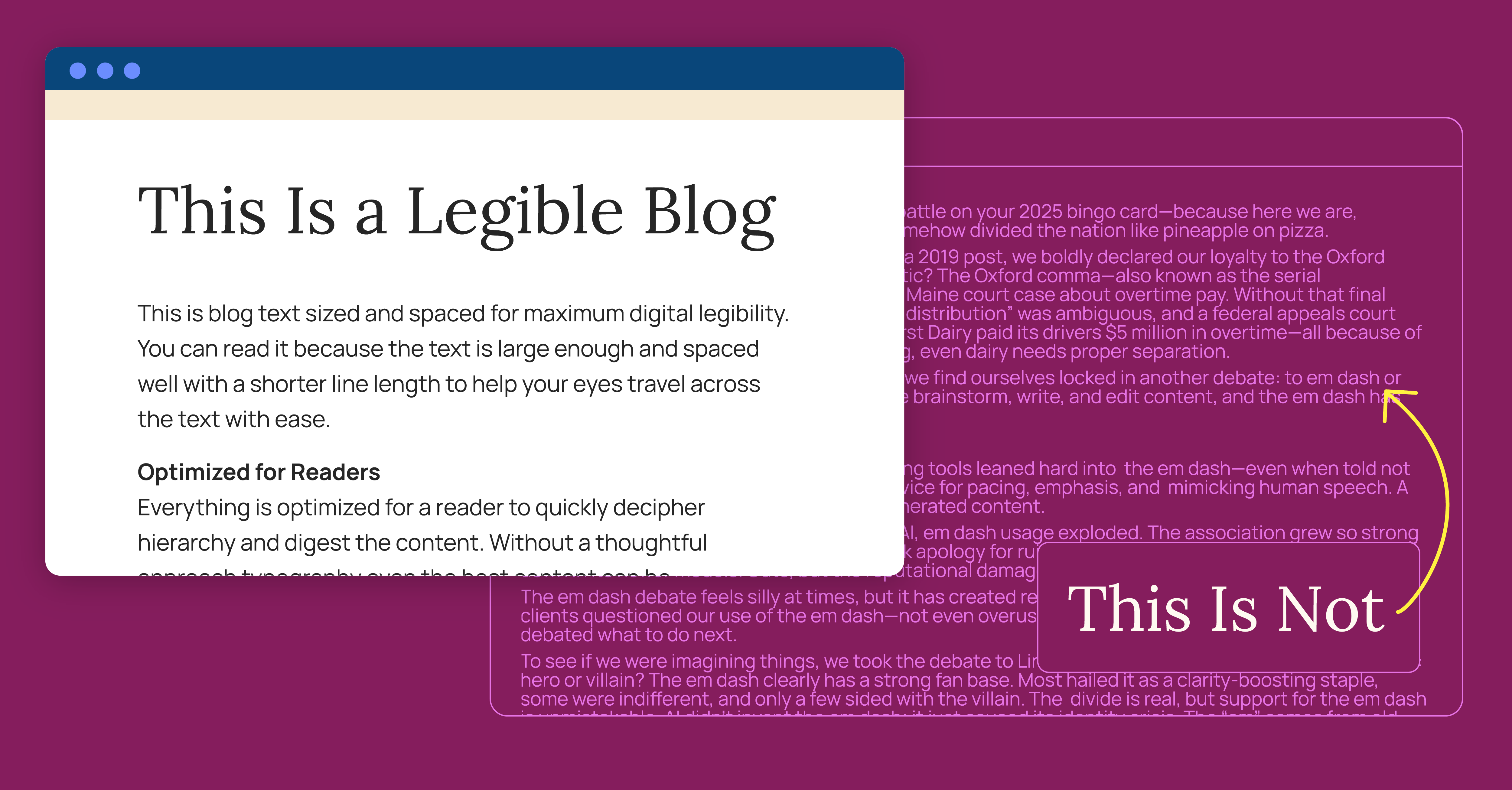
But this default size is often too small for large, blog-style blocks of text:
Raise your hand if you had a fierce em dash battle on your 2025 bingo card—because here we are, obsessed with a tiny horizontal line that’s somehow divided the nation like pineapple on pizza.
Grammar turf wars aren’t new at Hencove. In a 2019 post, we boldly declared our loyalty to the Oxford comma. Think the em dash debacle is dramatic? The Oxford comma—also known as the serial comma—played the main character in a 2018 Maine court case about overtime pay. Without that final comma, the phrase “packing for shipment or distribution” was ambiguous, and a federal appeals court ruled the statute favored employees. Oakhurst Dairy paid its drivers $5 million in overtime—all because of one absent comma, proof that in legal writing, even dairy needs proper separation.
Fast forward to today. Amid the AI explosion, we find ourselves locked in another debate: to em dash or not. It’s no secret that AI is reshaping how we brainstorm, write, and edit content, and the em dash has found itself at center stage.
Excerpt from The Em Dash Hill We’re Willing to Die On
The text starts to blend into a blob of characters that hurts readers' eyes.
Too big is also a problem—it takes up too much space, requires extra scrolling, and looks too important compared to headers.
Instead, we use a happy medium: 18–20px (about 1.125–1.25 rem) fits nicely within the page design without becoming a blob of letters.2
2. Choosing the right line length
Line length is also crucial for readability in long-form web content.
If you're on a mobile device, and this text stretches to both sides of your screen, these examples won't be effective. Check this post out on a tablet or computer with the browser window maximized to see the full effect.
When text stretches too wide, our eyes travel too far from the end of one line to the start of the next. It's easy to jump down an extra line, or reread the same one, slowing readers down and hurting comprehension.
In mature markets, product differentiation is the dream. It’s the idea that your offering brings something others don’t—a smarter workflow, a better outcome, a more effective product. For decades, B2B companies have leaned hard on that promise, using technical specs and unique selling points to carve out space in crowded industries.
That kind of differentiation is getting harder to sustain. Whether you’re selling professional services, SaaS platforms, or medical equipment, chances are you’ve come to an uncomfortable realization: “Our product isn’t as unique as we think it is.” Don’t worry, you’re not alone.
The sameness isn’t your fault. It’s the natural and common result of industry evolution, shared suppliers, and technology democratization. Everyone’s working with the same tools and chasing the same problems.
Here’s the good news: even if your product or service isn’t differentiated, there are other ways you can stand out from the crowd. One is a one-of-a-kind brand identity. A unique voice, perspective, and brand experience can cut through the noise. And marketing has the power to create that separation.
Text that's too skinny is less of a problem these days, as we've all grown accustomed to phone screens. Still, it's best to use the real-estate available on larger screens without forcing too many line jumps.
It's generally accepted that 50–75 characters is the ideal line length for long-form content on the web.
3. Spacing lines for clarity
Leading is the space between adjacent lines of type. On the web, we call this line height.
Small variances in line height can vastly affect your content's readability.
Too small, and text becomes cramped and hard to read, with ascenders and descenders (like those on f and g) even colliding:
In today’s world, work-from-home models are as common as they are hotly debated. While comfort and convenience make excellent upsides, working from home can come with drawbacks: straining communication, limiting in-person interactions, and filling the day with countless distractions.
As a hybrid company spanning multiple cities, Hencove is familiar with the ups and downs of remote work. While we’re constantly finding new opportunities to connect and collaborate online, we’re far from immune to the challenges of navigating the virtual workplace.
This month, as we transition away from our dedicated office space and embrace working virtually, maintaining efficiency and a positive employee experience is at the forefront of our minds. We’ve found that when it comes to maximizing productivity while reaping the benefits of a five-second commute, success starts with one’s mindset. Today, we’re exploring how you can manage your attention, optimize your focus, and make the most of your remote workday.
Excerpt from Mastering the Art of Attention Management
Too large, and the lines feel disconnected; tracking from one line to the next gets harder, and differentiating paragraphs becomes more difficult:
In today’s world, work-from-home models are as common as they are hotly debated. While comfort and convenience make excellent upsides, working from home can come with drawbacks: straining communication, limiting in-person interactions, and filling the day with countless distractions.
As a hybrid company spanning multiple cities, Hencove is familiar with the ups and downs of remote work. While we’re constantly finding new opportunities to connect and collaborate online, we’re far from immune to the challenges of navigating the virtual workplace.
This month, as we transition away from our dedicated office space and embrace working virtually, maintaining efficiency and a positive employee experience is at the forefront of our minds. We’ve found that when it comes to maximizing productivity while reaping the benefits of a five-second commute, success starts with one’s mindset. Today, we’re exploring how you can manage your attention, optimize your focus, and make the most of your remote workday.
Excerpt from Mastering the Art of Attention Management
This isn't a high school English class—no need to double-space your blogs. Pick a line height that works well with your font and size, giving each line the space to breathe without overdoing it.
4. Give your paragraphs breathing room
Paragraphs need enough space between them so that users can easily skim from one to the next. This breaks up the text and makes your content more digestible.
Too little or no space makes content hard to parse:
Raise your hand if you had a fierce em dash battle on your 2025 bingo card—because here we are, obsessed with a tiny horizontal line that’s somehow divided the nation like pineapple on pizza.
Grammar turf wars aren’t new at Hencove. In a 2019 post, we boldly declared our loyalty to the Oxford comma. Think the em dash debacle is dramatic? The Oxford comma—also known as the serial comma—played the main character in a 2018 Maine court case about overtime pay. Without that final comma, the phrase “packing for shipment or distribution” was ambiguous, and a federal appeals court ruled the statute favored employees. Oakhurst Dairy paid its drivers $5 million in overtime—all because of one absent comma, proof that in legal writing, even dairy needs proper separation.
Fast forward to today. Amid the AI explosion, we find ourselves locked in another debate: to em dash or not. It’s no secret that AI is reshaping how we brainstorm, write, and edit content, and the em dash has found itself at center stage.
Excerpt from The Em Dash Hill We’re Willing to Die On
Line breaks between paragraphs give them room to breathe and provide natural breaks for readers:
Raise your hand if you had a fierce em dash battle on your 2025 bingo card—because here we are, obsessed with a tiny horizontal line that’s somehow divided the nation like pineapple on pizza.
Grammar turf wars aren’t new at Hencove. In a 2019 post, we boldly declared our loyalty to the Oxford comma. Think the em dash debacle is dramatic? The Oxford comma—also known as the serial comma—played the main character in a 2018 Maine court case about overtime pay. Without that final comma, the phrase “packing for shipment or distribution” was ambiguous, and a federal appeals court ruled the statute favored employees. Oakhurst Dairy paid its drivers $5 million in overtime—all because of one absent comma, proof that in legal writing, even dairy needs proper separation.
Fast forward to today. Amid the AI explosion, we find ourselves locked in another debate: to em dash or not. It’s no secret that AI is reshaping how we brainstorm, write, and edit content, and the em dash has found itself at center stage.
Excerpt from The Em Dash Hill We’re Willing to Die On
5. Fonts that support long-form content
Font choice is essential for readable content.
A font that's too decorative makes things harder to read:
We’ve glorified focus mode at work, and I’ll be the first to say I’m a huge fan of getting heads down on a project. I’ve been known to completely tune out what’s going on around me when I get absorbed in the work. That type of concentration matters, but so does letting your attention bend toward something unexpected.
Our attention is elastic. It can stretch toward the things that make us laugh or feel connected, then snap back when it’s time to deliver. That same elasticity is what lets us step away from a spreadsheet and into a Slack thread, only to return with a sharper idea. It’s not wasted time, it’s the stretch that makes the snap back stronger.
Excerpt from The Elasticity of Attention
Serif and sans-serif fonts both work well in the right context. Just remember—different fonts demand different sizes and line heights for the same effect:
We’ve glorified focus mode at work, and I’ll be the first to say I’m a huge fan of getting heads down on a project. I’ve been known to completely tune out what’s going on around me when I get absorbed in the work. That type of concentration matters, but so does letting your attention bend toward something unexpected.
Our attention is elastic. It can stretch toward the things that make us laugh or feel connected, then snap back when it’s time to deliver. That same elasticity is what lets us step away from a spreadsheet and into a Slack thread, only to return with a sharper idea. It’s not wasted time, it’s the stretch that makes the snap back stronger.
Excerpt from The Elasticity of Attention
When Design Meets Readability
Overall, content structure is still king. It doesn't matter if your text is beautifully formatted and infinitely readable—if it's not skimmable, guided, and visually organized, most readers won't make it far.
But for the longer-form content that needs to be read, good design and development can make the reading experience much more pleasant.
Footnotes
1.
What font size is 1 rem equals can be changed by the user—for example, someone with low vision may increase their browser's default font size.
When developing with accessibility and responsiveness in mind, "rem" units are used for sizing and scaling all relevant page content. Thus, when someone increases their browser's default text size, all (correctly developed) websites should also scale up accordingly.
For the sake of simplicity, though, we'll operate on the notion of 1 rem = 16px = the default font size, since most users don't alter their browser's font size settings.
2.
This actually led me to an interesting conundrum on our own blog. We use fluid responsive rem sizing to let text and content scale with display size—making the site look its best across as many screen sizes as possible, dynamically. This method relies on varying the root em size with the window size, which works great on 90% of the site.
But on the blog, it means our carefully chosen font size for readability can get too large on bigger screens or too small on smaller ones.
Sure, we could just switch to px values to avoid this, but then the whole point of using rems for sizing (user-controlled font sizing) goes out the window, as users preferences would be ignored.