
Kusama’s Dots Weren’t a Pattern. They Were a Point of View
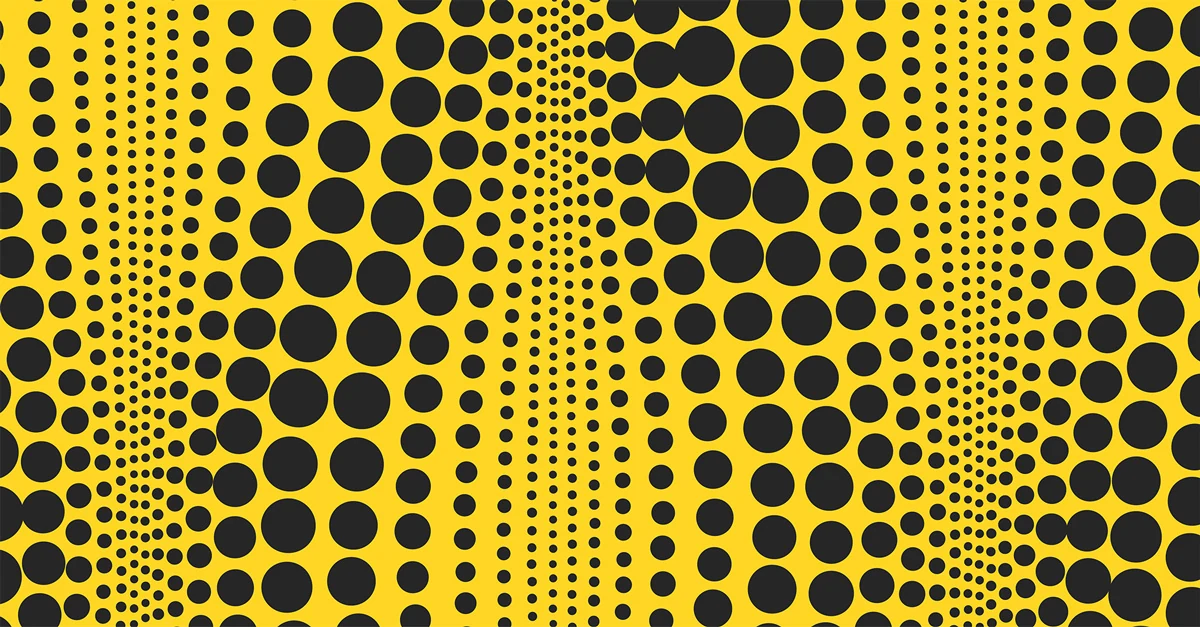
When I heard Yayoi Kusama had died in August, I felt shock first, then something closer to awe. She was 97, and her studio said she kept painting until her final days. Over a career spanning more than seven decades, she left a mark on art and design that few people ever come close to, and her work stayed iconic and beautiful in every form it took, from paintings and sculptures to fashion and entire rooms.
Then I learned something that changed how I see all of it: Kusama didn't choose the dots. She saw them. At a young age, she experienced hallucinations of patterns and dots spreading over everything around her, and she spent the rest of her life putting them into her work.
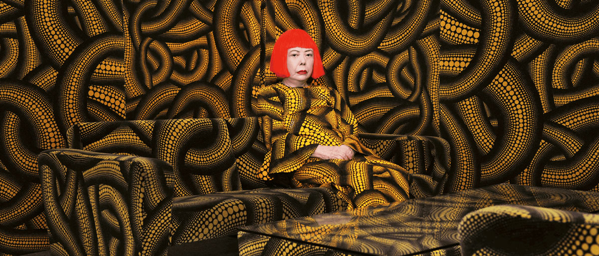
As someone who spends most of my days helping brands figure out how to be remembered, I couldn't let that go. In branding, repetition gets most of the credit. Show up the same way enough times, and people will remember you. Kusama repeated the same dot for 70 years, so it's tempting to call her the ultimate case study in consistency.
But I think that's only half the story. Her dots came from how she saw the world, which is why they never got old. Consistency lasts when it comes from something true.
The Dots Picked Her
Kusama was born in 1929 in Matsumoto, Japan, and grew up near her family's plant nursery. At around age 10, she began having vivid hallucinations. In one she later described, she looked up from a tablecloth covered in red flowers and watched the pattern spread across the ceiling, the windows, and eventually her own body.
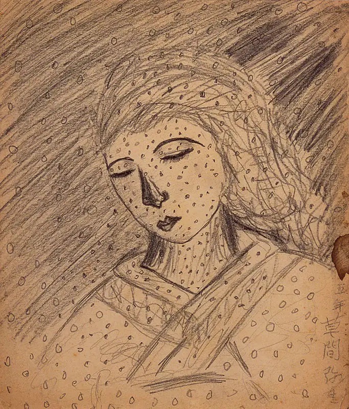
Instead of running from what she saw, she drew it. One of her earliest surviving drawings, from 1939, shows a woman in a kimono with dots scattered across the image. Art became her way of coping, and the dots became her way of showing the rest of us what her world looked like.
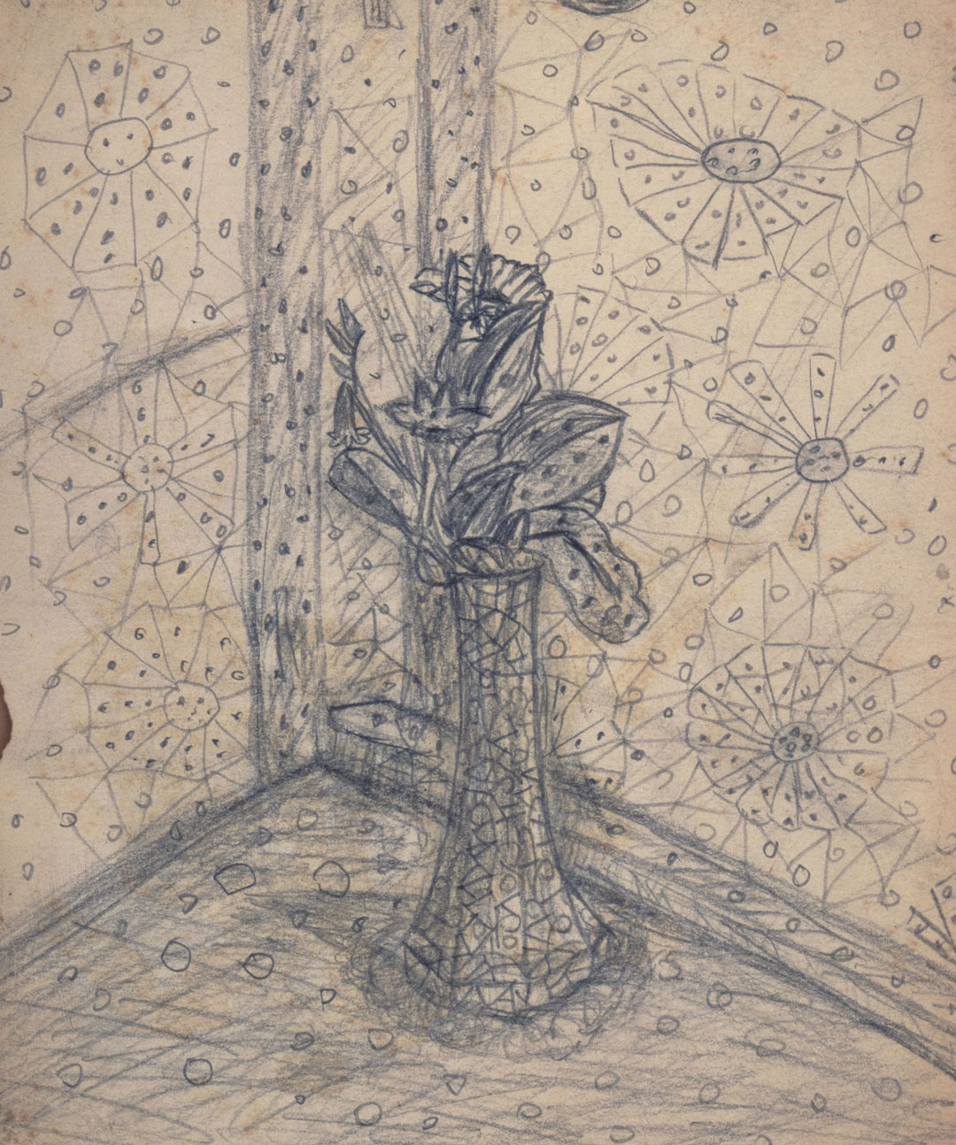
I'd always seen her dots as playful. Now that I know where they came from, they feel less like decoration and more like a piece of her. As a designer, I spend a lot of my time helping clients choose visual elements. Kusama never had to choose hers, which might be why her work is so hard to imitate.
In other words, her signature wasn't something she picked off a mood board. It was the lens she saw everything through.
Canvas, Pumpkin, Handbag, Repeat
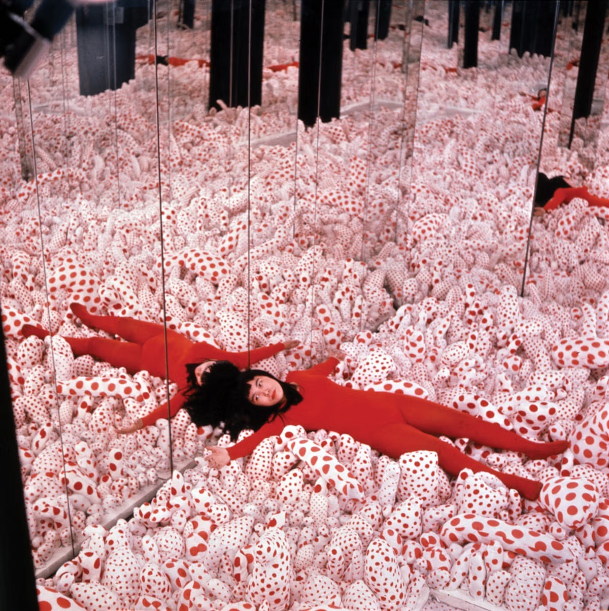
When Kusama moved to New York in the late 1950s, she made her name with Infinity Nets: huge canvases covered edge to edge in tiny loops of paint. In 1965, she built her first Infinity Mirror Room, turning her patterns into a space that seemed to go on forever. I love how naturally the idea scaled. What filled a canvas could fill a whole room without losing what made it hers.

Then came the pumpkins, covered in dots and scaled up to monumental size. Their roots went back to her childhood among her family's plants. One of the best-known sits at the end of a pier on the Japanese island of Naoshima. I find it kind of sweet that one of her most famous works grew out of something she knew as a child. Her biggest ideas came from somewhere personal.

Even luxury fashion made room for her vision. When Louis Vuitton partnered with her in 2012 and again in 2023, her dots appeared on handbags, trunks, and entire storefronts. When I see those products, I don't need to read a label to know whose work it is. The dots say it for her.
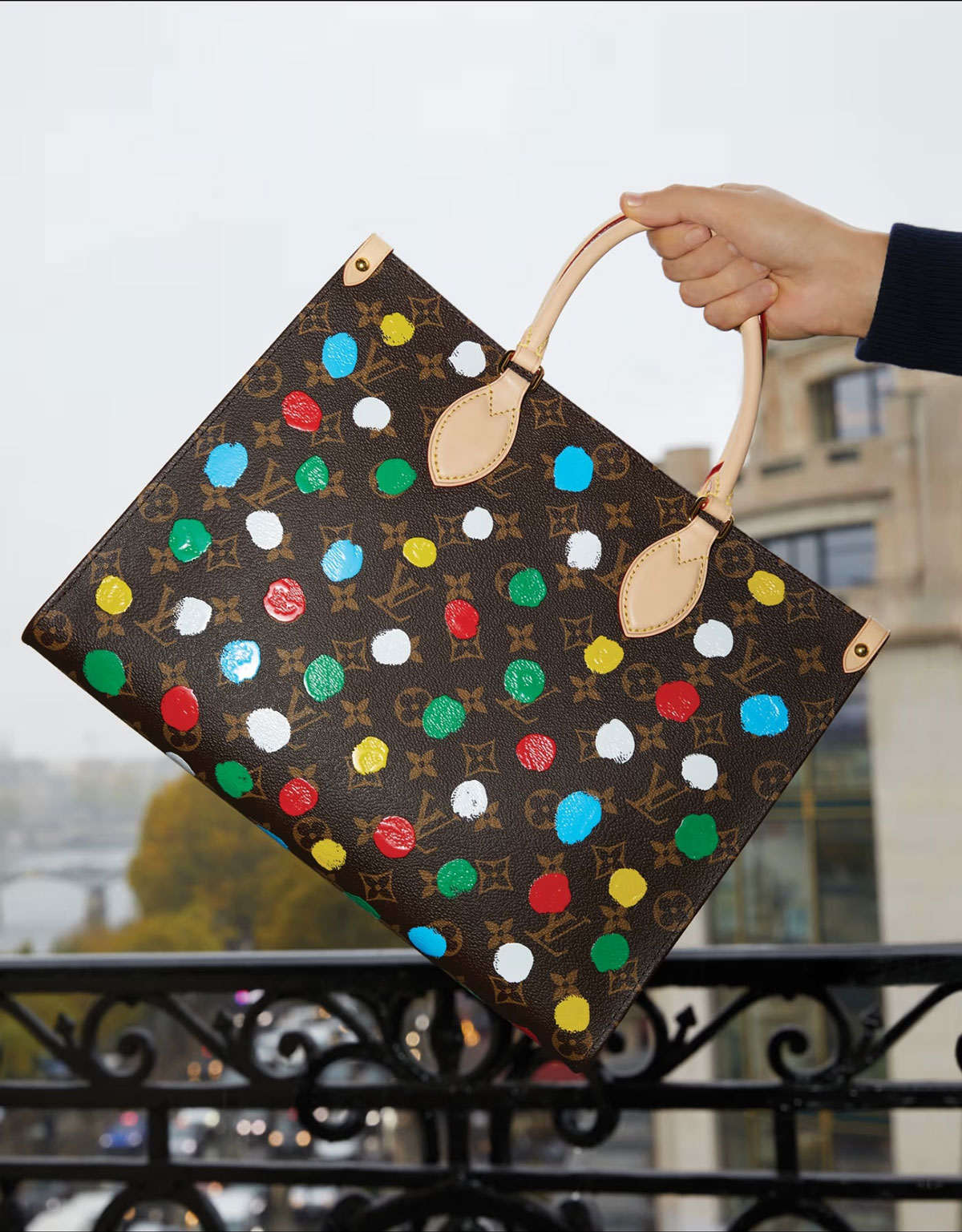
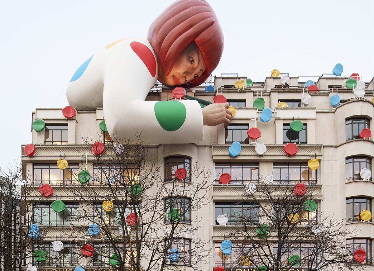
Here's what strikes me most: the format changed constantly, but the core idea never did. She didn't reinvent herself every time she tried a new medium, and she didn't need a style guide to stay consistent. The dots came with her because they were part of her.
Why It Never Got Old
Kusama repeated herself for 70 years, and it's hard to imagine anyone walking into one of her shows thinking, "Dots again?" They walked in because of the dots.
In branding, that kind of patience is hard to come by. It's a common instinct in B2B: a company commits to a look, uses it for a couple of years, and starts to wonder if it's getting stale. So the team tweaks the colors, tries a new illustration style, or launches a campaign that looks nothing like the last one.
Designers feel it too. After months of looking at the same brand, I'm itching to try something new. Over time, I've learned that itch often means the brand is working, not that it's broken.
Part of that is exposure. The people behind a brand see it every day, while customers are often just starting to recognize it. But there's something deeper too. A look that isn't tied to anything specific to the company, like a trendy palette or a style borrowed from someone else, tends to wear out sooner because there's nothing underneath it. A signature rooted in who you are doesn't have that problem.
Kusama proved that for 70 years. When what you repeat is true to you, it doesn't get old. It gets recognized.
Find Your Dot
So what does this mean for a B2B company in healthcare, finance, or tech? You probably don't need an Infinity Room. But you do need a dot.
Where do you start? The same place Kusama did: with what's true. Here are the questions we ask first: Why does your company exist? Is there a story behind how it all started? What's a customer problem you see that everyone else seems to miss? And what do you believe that your competitors don't?
We recently worked on a brand refresh for InterPayments, a credit card surcharging company we've partnered with for a while. Its brand already had a dot: zigzag lines inspired by the path a surcharge takes through the payment process. The idea came from everything a surcharge has to pass through before it reaches the customer: card network rules, state laws, and a long list of checks in between. Instead of replacing it, we simplified it, gave it more personality, and let it take up more space. Today, those lines show up across the company's website as bold graphics of payments flowing through one clear path.

To me, that's what commitment looks like. The brand grows, and the dot grows with it. So, once you find yours, stick with it. Use it everywhere, from your website to your pitch decks to your social media, because the small touchpoints count just as much as the big campaigns. Then, write it into your brand guidelines so every designer, vendor, and new hire uses it in the same way.
What Kusama Leaves Behind
I started this blog post with the shock of losing Kusama, but I'm ending it with admiration. She never tried to be memorable. She just kept showing us the world the way she saw it, over and over, until none of us could look at a polka dot without thinking of her. If you're near Amsterdam, you can see that range for yourself at her retrospective at the Stedelijk Museum, open through January 17, 2027.
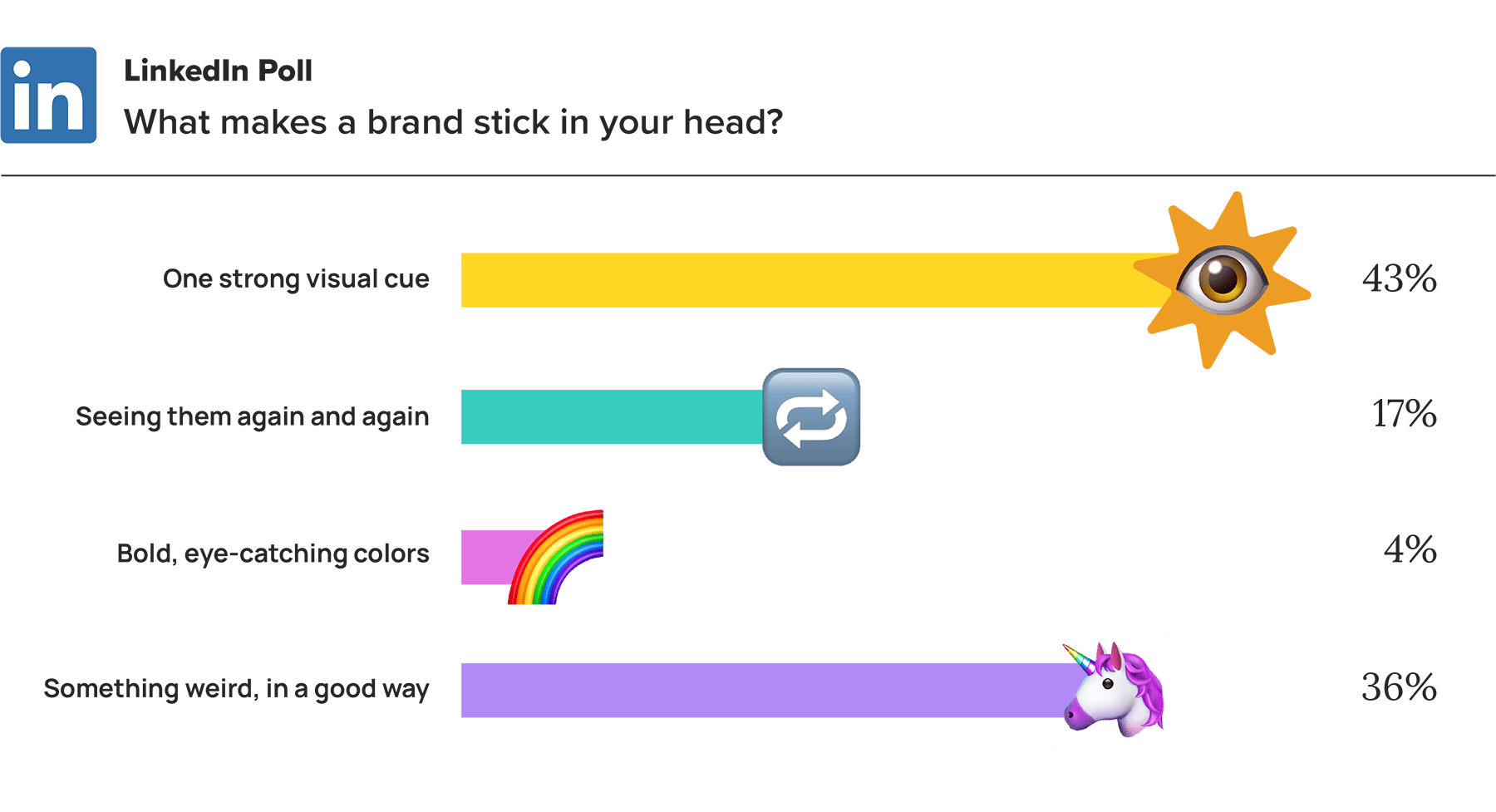
Turns out, our LinkedIn community agrees that repetition isn't everything. When we asked what makes a brand stick in your head, only 17% picked "Seeing it again and again." Most people went with "One strong visual cue" (43%) or "Something weird, in a good way" (36%). Kusama's dots were both: easy to spot and unlike anything else. Repetition helped, but it was never the whole story.
As we work with clients on new identities and rebrands, that's what we'll keep looking for: the thing that's genuinely yours, and a way to help people see it. If you're not sure what your dot is, or you're wondering whether it's time for a refresh, reach out to the Hencove team. Let's build a brand people recognize before they ever see your name.